Blog Archives
The Colour Red – or the Quest for LMS Crimson Lake
A topic that comes around from time to time, including to my lips, is what colour exactly is Crimson Lake? I thought that my analysis and that of others that have contributed to the discussions were worth sharing more widely; so here goes……….
The Historical Context
The first good insight I have is from George Dow who was a prolific author of the 1960s and 1970s, including on liveries who wrote in the Railway Modeller in 1973:
However authorative this is, fifty years later, with the change from natural to synthetic pigments this is not of great help. Also B&Q do not stock alizarin lake last time I looked as it is a pigment produced from a complicated processing of a vegetable and is probably fairly inconsistant anyway. https://www.winsornewton.com/row/articles/colours/spotlight-on-ruby-madder-alizarin/).
The Problem With Reds
Many years ago, when I was still in my shorts, I worked in a printing ink manufacturering business and red was one of our bugbears. This was for three reasons; as a colour it is less opaque than many colours so were prone to poor coverage, it is also prone to fading and like all paints, it is affected by the surface treatments, in our case varnishes. All of these issues affect how Crimson Lake appears on both the prototype and our models.
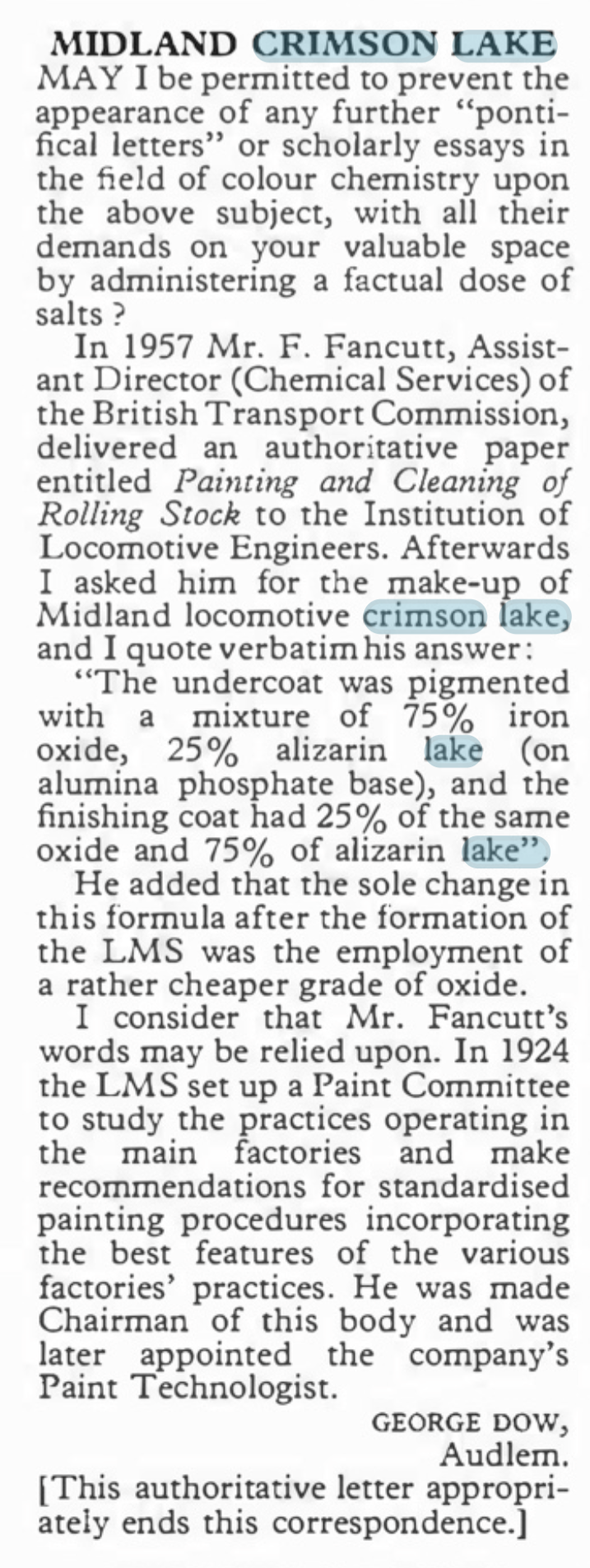
A Caledonian diagram 106 non-corridor composite shortly after being renumbered to 19952. This appears to have been acheived by painting over the predecessor number and then the application of the fresh number and then varnishing. The patches that have been so treated stare at you somewhat and ilustrate how the paint and lustre deteriorate! Photo by H.R. Norman ref 6081 and now in the NRM
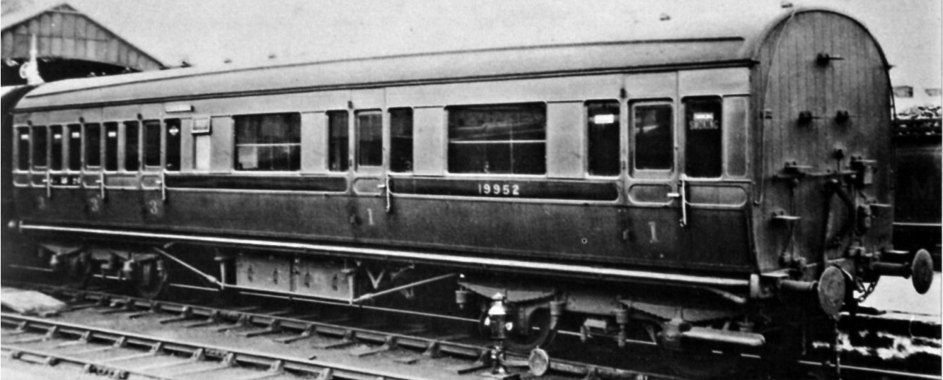
Its still a problem now too as this diagram 2171 full brake at Kidderminister shows. Photo SVR Enthusiast via Flickr
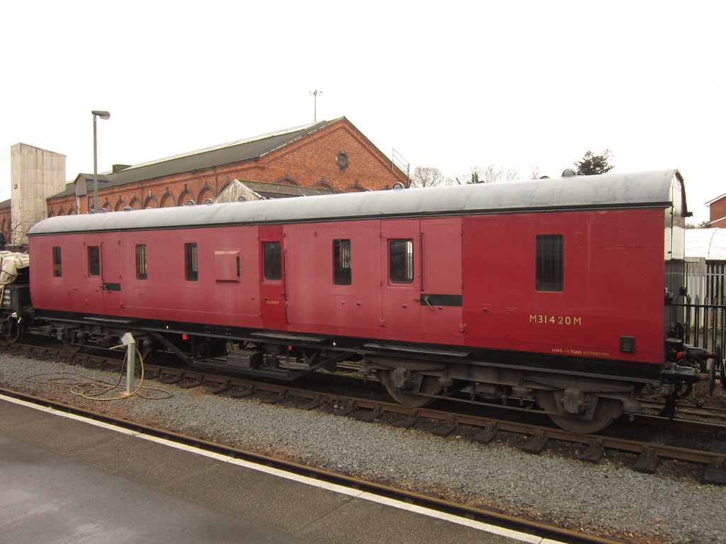
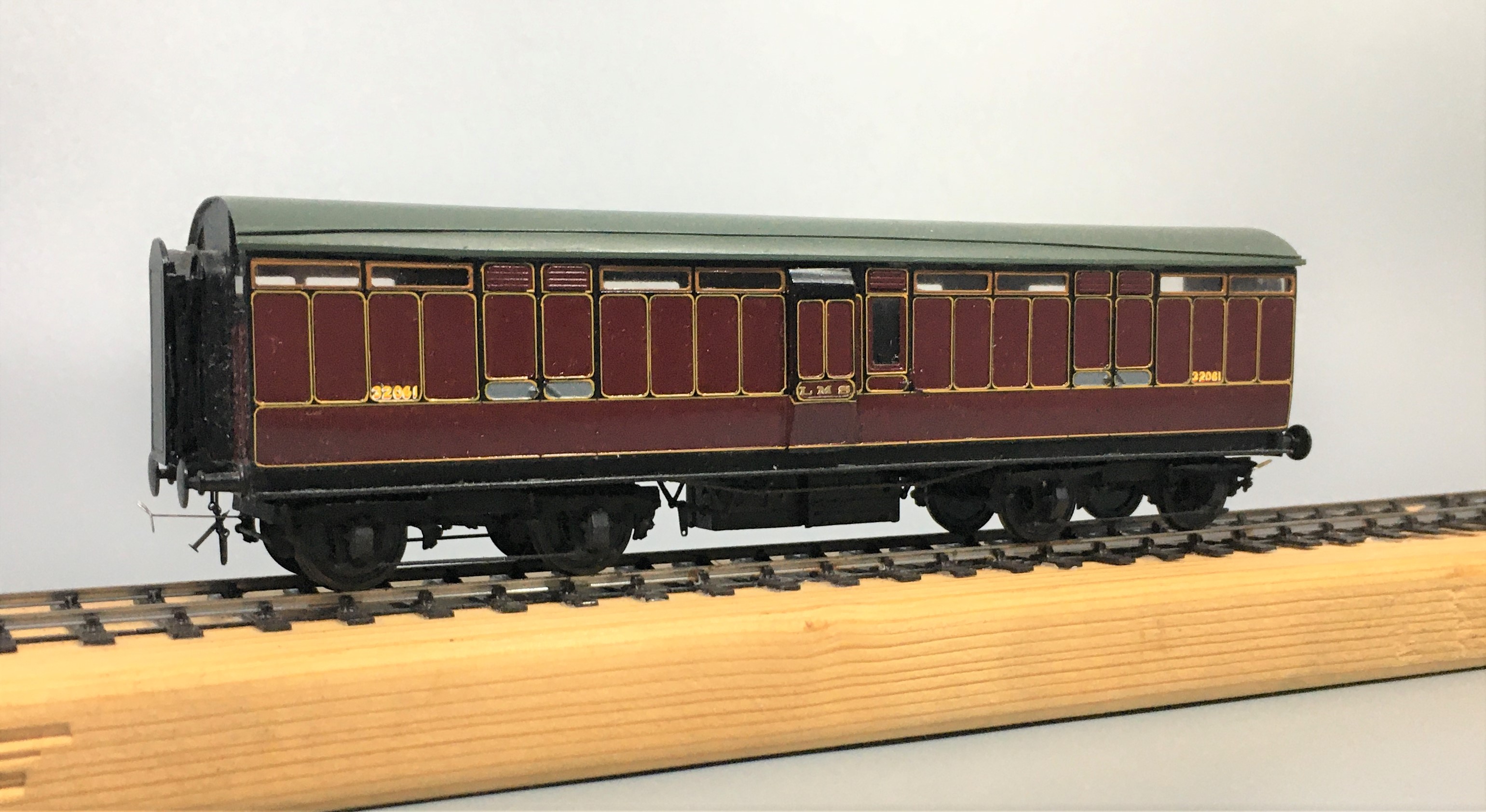
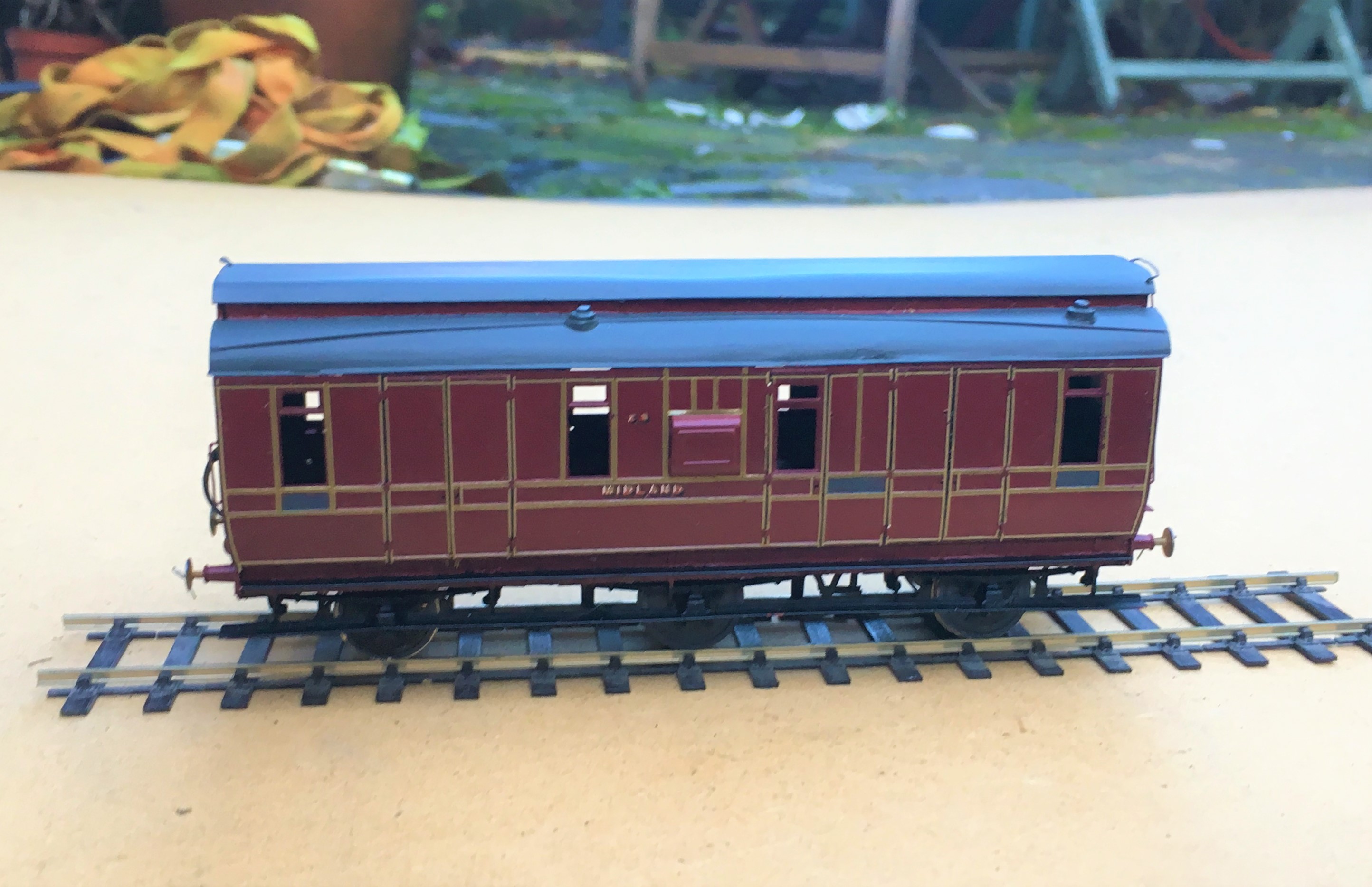
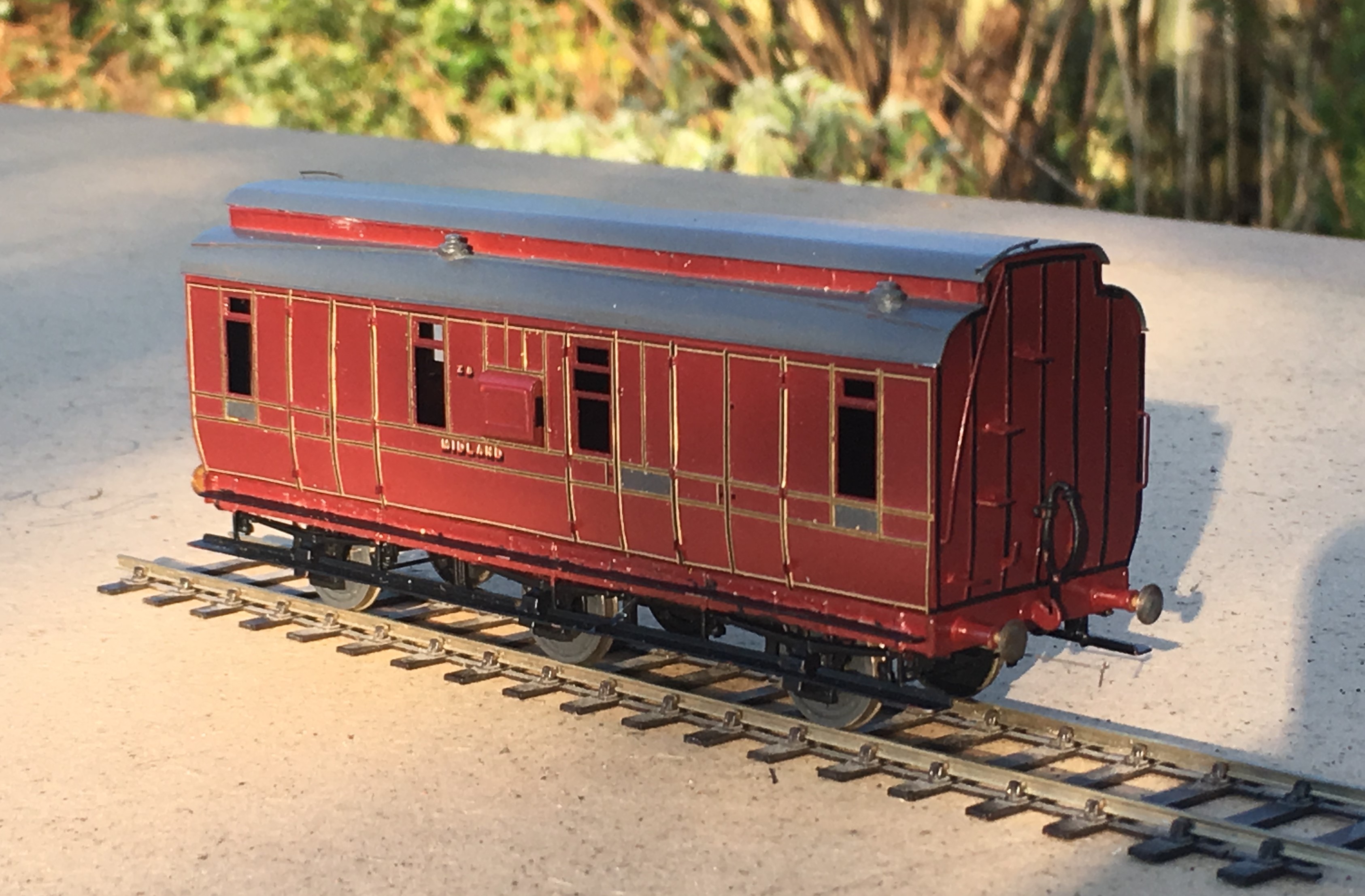
Both of these coaches have been painted in the same top coat, Precision Paints LMS Crimson Lake. The top coach, the clerstorey, followed the paint sequence noted by George Dow above – a first undercoat of LMS wagon grey, followed in turn by 75% grey, 25% crimson; 50% each; 25% grey, 75% crimson and finally 100% crimson. On the lower coach, the crimson was neat and painted over an undercoat of LNER bauxite. Both were painted at the same time, in otherwise the same manner and in both cases they were varnished but not weathered. The difference is startling! Photo and models by John Hastings Thompson.
Does Colour Scale
Like weight, I am not convinced that colour scales or perhaps it does but given that our models are smaller than the prototype it is more heavily heavily by contrast. I am sure we all know about the optical illusion causing the viewer to read differnt colours of the same sample by virtue of the background – is this happening to us as we perceive the colour of a model? Try the sampel from the Exploratoium below:
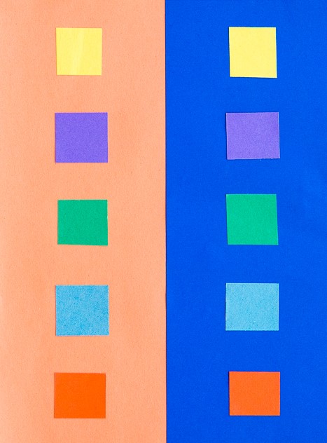
The presence of lining is also a major influence of the feel of the colour. The gold and black of the LMS seems to add a bit of sparkle and depth of colour to the red.
It was a Long Time Ago
We must also remember that the last LMS crimson lake locomotive or coach will have been repainted seventy years ago and even the last BR maroon loco was withdrawn sixty years ago (plus there is the argument as to whether they realy were the same colour as well!). Whose memory of colour is good enough to survive this long? Even photographs from this era as a whole cannot be relied upon due to the variability of colour rendition, the nature of the light that the subject was recorded in or the level of contrast with its surrounding – none of these issues have gone away with modern digital photographs!
I for one have never seen either original colour and my view of what crimson lake is being based on the preserved locomotives that I have seen over my life. Have the preservationist got it right? Maybe they are better informed than you or but if this was true, why is there so much variation in the colour from the ready to run manufacturers or even the paint manufactuers?
However, whether they are right or not, the preservation scene has set my expectation of what the right colour is and I suspect the same would be true for all of us. Whilst I hate making modelling decisions on any history which is not real, I have reached the conclusion that the right colour for me is one that matches what I have seen in the UK preservation scene.
Where does this leave us?
Possibly the first conclusion is that there are a wide variety of reds that we can safely consider to be correct for Crimson Lake – phew, because when I look at my models I do have variences!
The second conclusion is not only is some inconsistancy acceptable, it is actually essential because red faded so noticeably. I am less convinced that the changing of hues seen across some colours but a toning down of the colour and tinging to a more matt colour is definitely prototypical.
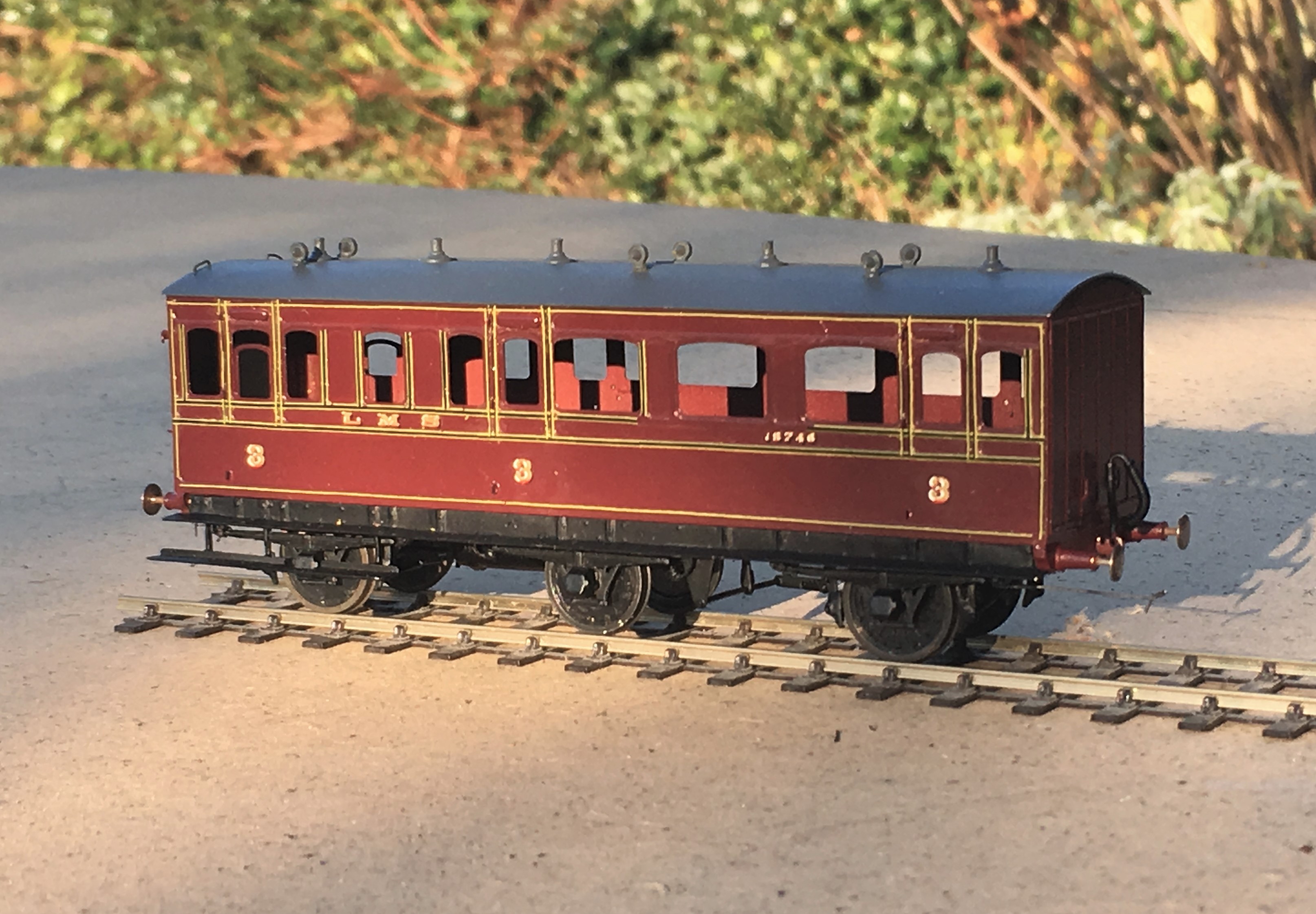
In my personal quest for a colour I have been through multiple agonies to get the right colour. Thirty years ago, it was Precision Paints Crimson Lake but this seemed (to me anyway) change and become too purple over time. I then used Rover Damesk Red from a rattle can but found this too uncontrolable or, if I held it further from the model prone to to giving the orange peel effect. I was then put on to the solution to all our colour problems by Jim Smellie (of Caley Coaches).
This suggestion was to use the colour that the preservation industry generally use to source paint for the 12 inch to the foot models. This comes from Craftsmaster paint who have a series of specialist railway colours for most of the colours that we will wish to use. I use a numberof their colours including Crimson Lake. I have yet to adulterate this but i do intend to let it down with some white to imitate fading – hopefully this will not send me down another quest for the right faded Crimson Lake!

Lining Things Up….
As usual, I set off over the festive break with plans to do all sorts of things and failed to do any of them fully. One aspect that I did get moved forward though was the painting and lining of a couple of my six wheeled coaches.
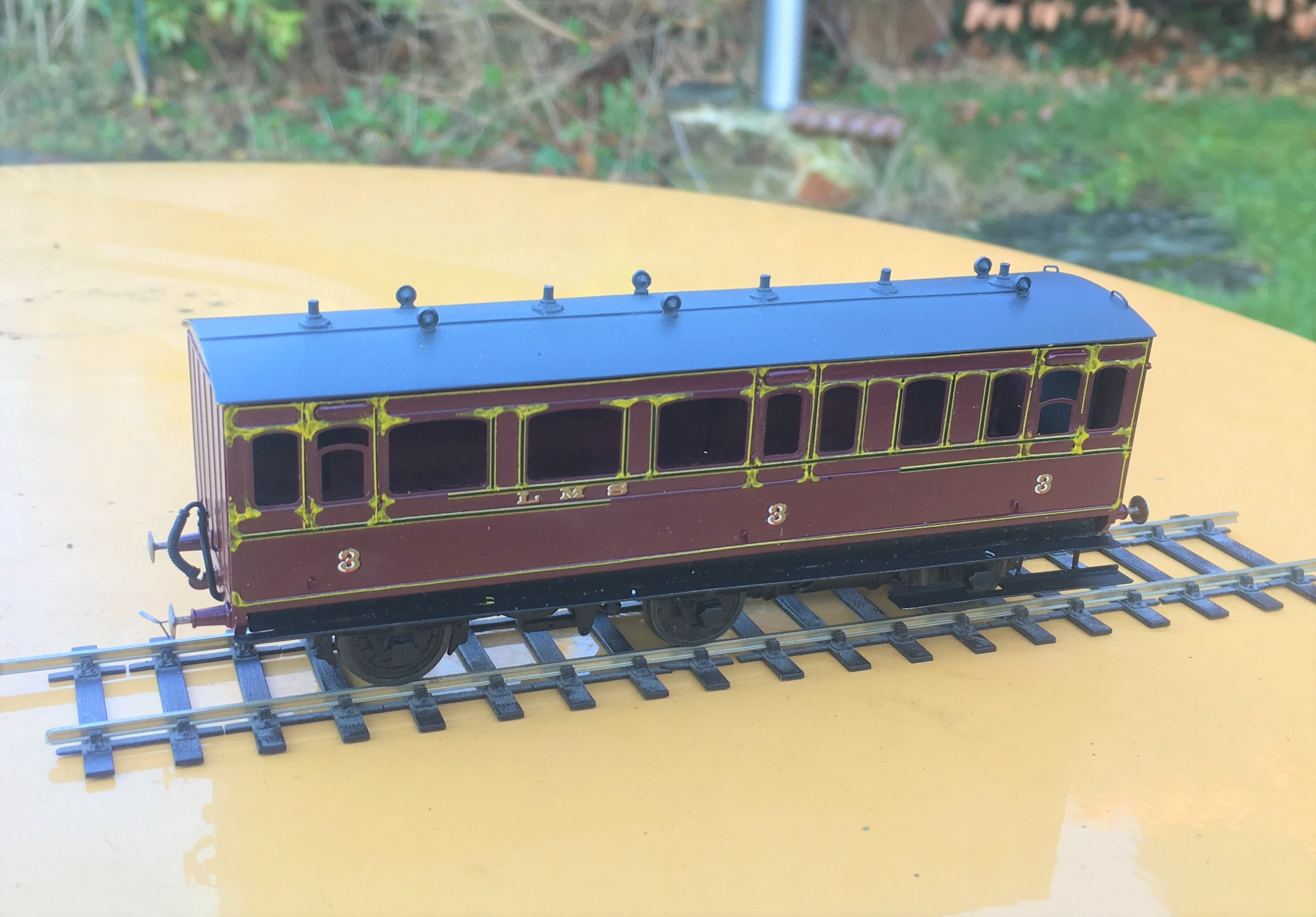
Back in my youth, lining pens held no fear and I could genuinely dash off a fully lined coach in a few evenings. Thirty years of pushing a computer keyboard has dulled my drawing skills to the point where I am close to terrified to pick up a bow pen and I have not had the nerve to line a coach for a long time. I am confronting this fear in a couple of months by attending a class run by Ian Rathbone on painting and lining at Missenden Railway Modellers. In the meantime, however, I can still line utilising transfers, in this case those provided by Fox Transfers.
Being preformed in straight lines, these do work best for the square panelled beading of some of the Midland Clayton stock, like my dia 501 full brake. I had taken care in designing this with beading sizes that were correct (and matched the Fox Transfers). They thus work quite well I think.
I deliberately left the handrails and door handles off at this stage to make the lining easier but the door hinges still created problems that I will need to touch in with acrylic paints; burnt ochre looks about right. I also still need to block in the black to the head and foot of the sides plus where the lengths of transfer where they crossed – I will do this with a Roting pen as I still feel confident enought to wield this!
So there is still plenty to do, but I am dead chuffed with this and it will soon be finished and ready for service.
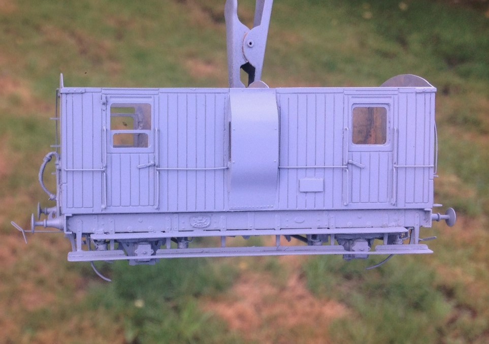
Second up is a Lochgorm Models third class saloon that has been waiting for its lining for rather longer. It is a more difficult prospect to line as it has round corners to the panels and, over the doors and windows, shallow arcs. These can’t be formed with transfers as these are straight. I have thus used the transfers for the straight sections and then brush painted the curved sections with cadmium yellow acrylic paint.
If all goes well, the Roting pen can then be used to infill the black to the centre and form the curves across the windows and doors. Lets see!
In Praise of Cellulose Paint
A few months ago I was criticised for preferring to use cellulose paint when I spray; the concern being that cellulose thinners are aggressive and will damage the air-brush.
On the basis that I am of the view that “if it works for me” then I am going to carry on using it I am doing so. I am helped by knowing that I am not alone in my preference as Ian Rathbone also recommends it and also because I have not yet had any issues with my airbrush.
The reason I prefer cellulose is that it gives an amazingly smooth paint finish every time, it drys very quick and gives a very durable finish. Judge the former at least for yourself.
More on the model in a future post……..
